Design for Accessibility
As a part of my education at Chalmers University of Technology, my group and I created a concept for the Gothenburg city Library. The concept aimed to make the entrance of the library more accessible for senior citizens, legally blind visitors and people in wheelchairs as well as temporarily disabled (users of crutches).
Made in collaboration with A. Brunzell, E. Isaksson and A. Letfors


Process
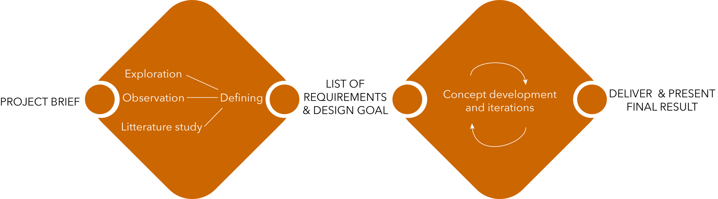
For this project we visited the city library to make observations and explore the area through self studies. This was done by experiencing the library from the point of view of the defined target groups. For example, we tried navigating the entrance by wheelchair. Further, an extensive literature study was conducted and all the data collected was analysed to form a list of requirements.
After this step several iterations were made to develop a concept for a new library entrance that met the list of requirements. In the end the project (design proposal and video prototype) was presented to our course leaders.
Requirements
The requirements for the re-design are divided into 6 different categories, where the first covers
general and psychological aspects and the other five the ergonomic aspects, both from a
physiological and a cognitive standpoint. Below is the design evaluated from
the perspective of each requirement section.

General Requirements
are all about inclusion, the aesthetics and independence. You should feel like everyone else, not that you are abnormal and need different areas made only for you, instead you should be a part of a cohesive space. This was fulfilled by integrating everything in the piece, making it accessible for anyone, by creating a dynamic space and hence allowing for ergonomic adaptations for the impaired to become an integral part of the design and being perceived as part of the artistic idiom.

Accessibility
requirements included tactile orientation, distribution, acquiring help and maneuvering space. Tactile information is available throughout the Service Area and the distribution of the pieces are logical, based on how one moves in the library. The Service Area is more open and within the area conceptualised, there is maneuvering space available for two wheelchairs to meet or travel together as well as doing 180-degrees turns. There is tactility on the floor but also on the return station. The simplification of the whole area makes it much easier to understand where to get help, but also much easier for the librarians to spot users needing help.

Reachability
requirements covered reaching at different heights and depths. By using the elliptical shape for the individual borrow desks, the interaction points are moved closer to the edge and made it more physically comfortable. Being able to face forward while interacting, a key requirement, has been made possible by using floating desks, thus no obstruction underneath. However, a compromise had to be made for the Information Desk where a limit was set for the protrusion of the desktop.

Visibility
requirements have been worked with in all the areas. Even though the displays have not been dealt with specifically, the displays used at the Return Station are now replaced with a button, a much simpler interface and requires less cognitive load. The books can be returned in any direction and orientation, everything works. Colors have been worked with to highlight important areas and create contrast to heighten the visibility. The accent color indicates interaction and provides a contrast to the other part of the design. The surrounding lighting is at an adequate level.

Relieveability
requirements covered the possibility to get relief of physical load. This was solved by creating a place for crutches and bags and also space for unloading on top of the desks. Worth noting is that the cutouts for crutches and bags could be included in any desk in any space. All tasks can also be done without the need to turn. There is seating, in the form of benches, spread out in the service area providing both relief and space for social interaction. These already existed, so they were not considered further in this design. The transportation of books in the Service Area was not covered in this concept.

Usability
requirements were tackled by making the Return Station less complex, interactions were greatly simplified and can be performed while facing forward, hence maintaining a better ergonomic posture. The display was replaced by one button and a symbol on the desk by the opening in the glass, which gives textural support where to put the book before sliding it in. The visitor can return the book in any direction and the station indicates when it is ready for the next book. The procedure is ended by pressing one single button and a receipt will be printed as a proof of successfully returning the books, as simple as it gets. Furthermore, packing space and space for personal assistive equipment are also available at every piece, making it less of a hassle to perform the intended actions.